For businesses that live online, digital marketing efforts almost always point to a website. This website is where customers can interact with a business—schedule a phone call, buy an item, subscribe to a service, and many other things.
Needless to say, a website can make or break your business online. This is precisely why excellent web design is so essential. It can spell the difference between gaining a new customer and losing a potential lead.
This article will discuss five essential web design tips to help your business succeed online.
The best websites are intuitive. They are built in a way that is logical and makes sense to users. Furthermore, they provide a seamless path from landing page to conversion.
To build this “seamless path”, you need to understand how your users think.
Work with data
The information you collect about your users will help you understand their habits and preferences.
The first thing you should look at is quantitative data, particularly trends in spending habits and user navigation patterns.
Researching spending habits means analyzing data on what an how your potential customers behave, whether it’s by studying what goes on in your website and your wider market. This can provide you with immediate and applicable insights to your web design.
For example, a pool renovation service in Melbourne may discover that most customers in their area are interested in modern pool design. Simply adding more pages about modern pools on their site can go a long way in terms of increasing engagement.
Navigation paths, simply put, are how people get around your website. Knowing this is critical! After all, this is how your future customer gets from your homepage to click the checkout button. Using Google analytics tools such as the navigation summary, user flow report, and page analytics, you can get insights on where, how, and why guests are led from one point to another on your site.
Other tools, such as the user explorer can give you a better view of the kind of guests your site attracts.
For a full list of Google Analytics tools for user navigation path analysis, check out this article.
It’s also essential, however, to keep qualitative data in mind. Be sure to interact with your sales team. Some key questions to ask would be:
These are just some you can start with.
Build personas
Marketing personas are powerful tools for mapping consumer preferences. They’re profiles of your leads and customers, grouped by shared features. For example, a sports store may take a different approach in marketing to “Athletic Teen Guy”, than “Soccer Mom”. These profiles allow you to create tailored responses and content, and in turn, increase client acquisition and retention.
But how do we create these personas? A simple start would be an interview. Start small and gather three to four people that embody each persona. Two or three personas would be a good number to start with. From here, craft a questionnaire to get information on their demographic, key decision points in the purchasing process, how they buy products and services such as yours, and other relevant questions.
In any case, make sure that your interviewees know that your research isn’t a sales call, and make it easy for them to participate. Incentives and ease of answering go a long way.
For further reading, Hubspot created a timeless resource on personas that we highly recommend.
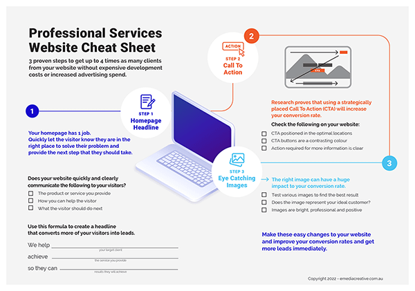
Your homepage should be simple, compelling, and easy to navigate. Do not stuff it full of clutter. Instead, provide site visitors with a hub that gives an overview of your business and links to increasingly complex pages.
A key concept is scannability. As put by Forbes, “most readers SCAN…they don’t read line by line.” Complicated homepages tend to be visually unappealing, busy, and ultimately daunting for consumers who may be after one specific product. This makes it hard for customers to skim over a page and find what they need, leading to lost sales.
To keep pages from becoming too busy, make sure that you mind your ad-to-content ratio, keeping it readable for visitors. Also, pay attention to the layout of your content. Does the reader’s eye have to jump from block to block of text? Does it flow smoothly?
On a larger scale, be sure to have a clear linking strategy when you make your website. Know how you want your customers to travel and to where. From here, design the site to make the journey as enjoyable as possible.
Length is another thing to keep in mind. When in doubt, keep it brief. Instead of forcing them to sift through your entire catalogue from the beginning, think of your homepage as an elevator pitch: just enough to get them to say, “Go on…”
The details and fine points do not belong on your home page: sub-pages exist for that purpose. Organise these according to relevant categories that help users find exactly what they’re after (and discover new offerings along the way).
A “call to action” (CTA) is a button or other interactive element of a web page that allows a user to complete a valuable action—like subscribing to receive emails, or making a purchase. It should come as no surprise that CTA’s are incredibly important.
How these elements are designed is a major subject of study and interest among marketers as this is where the magic happens. No CTA means no conversion of guest to client.
There are many ways to go about it, but conventional wisdom says your CTAs should be:
Try to think of major online businesses, say Netflix, Evernote, or Squarespace. How do they feature their CTA? Where does it appear? How do its colours complement the rest of the layout?
Use these insights to make your CTA as easy to spot and use as possible.
In March 2020, mobile phones accounted for more than half of the world’s internet activity. Building for mobile isn’t optional anymore; it’s essential. Making a website that isn’t optimised for mobile use isn’t just a major inconvenience. It can lead to lost customers.
There are many guides to designing for mobile, which we recommend you look into as the subject deserves more coverage than this article can offer.
A few points to consider as you research on optimising your site for mobile use would be designing from a “mobile-first” perspective, optimising resources, and using lazy-loading and web caching,
As always, test, test, and test when implementing these features.
Finally, optimising for mobile is a factor that many search engines use to determine page rank—meaning you risk getting buried beneath your competitors on a Google results page if you ignore it.
Some things you can do include adding your mobile site to the Google Search Console, building a responsive website, and verifying the crawl rate.
Many businesses make the mistake of thinking that once they get a passable version of their website up and running, it’s smooth sailing from there. It isn’t.
Competing in digital marketing means testing and optimising your website periodically for as long as you’re in business.
This involves running A/B tests to see what layouts, design elements, and content your users respond to best. Simply put, an A/B test involves splitting a given population into two groups at random, and exposing them to two iterations of the same marketing material. This allows you to see which is more effective, and in what way.
Continuous improvement also involves forming a close working relationship between your marketing manager and web developer to make sure that fresh, relevant content is created and published regularly.
Content marketing is a big step your business can take to stay fresh and relevant. It establishes your domain authority, helps you rank on search engines, and shows your users that your business is active and legitimate. It also generates traffic for your website through shareable bits.
But that’s only if it’s done right.
Content must be useful to your client. That way, instead of interrupting their day, your content adds value; they learn to seek it out. Along the way, they are motivated to purchase your product and share your content.
Keeping your website engaging, easy to use, and ultimately, capable of generating traffic and conversions is a lot of work. These five tips are just the starting point, but with the right tools, you can make your website one of your most high-performing assets.
If you’d like to learn more about digital marketing and building effective websites, contact us at Emedia Creative.
7 Steps To Creating A Successful Brochure

Use this easy-to-follow process to get up to 4 times more leads from your website