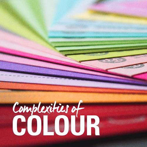
Why Colour Psychology is important to attract customers and increase sales
When you first set out to create that amazing website or killer brochure to attract customers, you probably didn’t think about the colour psychology behind your chosen colours.
For years marketers have been fascinated by colour psychology and how it can attract sales.
So much so, that colour psychology has transformed from a soft science into a research-backed marketing goliath.
But, there’s also a wealth of misinformation regarding colour psychology.
As marketers, we’re obsessed with science and statistics. They give relevance and show the significance that’s testable and repeatable, which means that science can help guide us to make smarter decisions and generate better results.
Today, we’re going to strip colour psychology down to its core. What colours should you use? When should you use them? How do they make your customers feel?
What is colour psychology?
Humans are visual creatures. In fact, 90% of all information transferred to the brain is visual, and those visuals are processed 60,000 times faster than text. Our brain is wired to recognise, interpret, and garner meaning from colour. To back that up, research shows that customers make a firm judgment on a product within 90 seconds — and up to 90% of that judgment is based solely on colour.
Why is colour psychology important in marketing?
When we say that humans are visual creatures, we’re being generous. 92.6% of customers say that visuals are the #1 most important aspect of their purchase decision. But, that’s visuals as a whole, right? What about just colour alone? 84.7% of customers say that colour is the primary reason that they purchase a product! The idea that you can influence over 80% of your customer base using colours alone may sound crazy. But, it’s true. HubSpot changed the colour on one CTA button from green to red and saw a 21% increase in performance. They didn’t include new text, images, or anything else. They simply changed a colour.
- Unbounce had a 14.5% increase in conversions by changing a green CTA to yellow-and-black.
- VegasSlotsOnline.com saw a 175% increase in conversions when they simply changed their sign up button. In fact, they changed the text, button size, position, and more, and none of their changes showed anywhere near the results that a simple colour change did.
How do colours improve conversion
But, before we jump into the juicy stuff, let’s talk about some caveats.
First, it’s important to understand that research shows that predicting what colours your customers expect your brand to have is more important than the individual colours themselves. In other words, Holden probably wouldn’t go over so well if its logo was pink. People expect speed and prestige when they’re shopping for cars, and pink doesn’t have a cultural association with “speed.” But, remember, colours aren’t universal. They are cultural. So, one colour may not mean the same thing to two different people.
The warm tones (red + yellow + orange)
Red
Red is the colour of urgency. Sales, promotions, and important reminders all work well with red. Coca-Cola, Levis, Monopoly, Target, and even NASA all share red logos. Why? For starters, the colour red has been shown to increase heart rates. Often called the colour of “passion” red can get people excited and ready to consume. Here’s the problem with the colour red. It also carries negative emotions like anger and frustration.
This influence of colour can often work in favour of those using it. Let’s look at fast-food restaurants — a significant portion use the colour red in their logo and branding. McDonald’s, Burger King, Sonic, Wendys, KFC, etc. all lean on the colour red. Why? Well, red sparks a sense of urgency and alertness. Fast food restaurants don’t want you to come in and sit down. They want you to get your food and leave as-soon-as-possible so that they can serve other customers. It’s a dynamic part of their overall profitability.
Let’s take McDonalds as an example of a company that knows how to use the colour red. In their fast food joints, red-and-yellow (both warm) are plastered everywhere. The walls, the sign, even the drive-through menu are drenched in red. But, when you go to their website, it’s completely different. Red is only used in the logo while black, blue, green, and dark greys are used as a predominant part of their nav menus.
- Red actually intensifies the experience of pain. If your business is in the medical industry, you may want to steer clear.
- Red acts as a warning sign in nature. It can alert animals of danger or poison.
- Red signals testosterone-driven dominance, which makes it perfect for sports brands.
- Some research shows that red may increase appetite.
How to use red to convert?
Yellow
- Speed: In many cultures, yellow is associated with movement. Brands like Ferrari and Sprint both use it to signify the speed of their services/products. Of course, McDonalds also uses yellow. But, again, they want you in-and-out.
- Attention: Since yellow plays with our optic nerves first, it’s a great choice for brands that want to stand out in a crowd. JB HiFi, NIKON and IKEA all use yellow to signify entertainment and happiness.
- Work: Finally, yellow can also push people to work more. Brands like Bic and Post-It use yellow to play on mental alertness and work enthusiasm.
Here are some things to note about the colour yellow.
- It’s been used in research to help relieve symptoms of depression.
- Yellow is universally associated with sunshine and happiness. And, almost every known culture associates yellow with light.
How to use yellow to convert?
Since yellow is so striking, it works well as an attention grabber. Plug a yellow CTA on your social campaigns, use yellow links in a brochure, or use yellow on critical components of your website UI to help push users to engage. As a branding tool, yellow is hyper-effective with brands that promote speed, happiness or want to appeal to younger children.
When to avoid yellow?
Orange
- The younger you are, the more likely you are to like the colour orange. In fact, in the 25 – 70 range orange is the single most disliked colour.
- Women generally dislike orange more than men.
- Unbounce claims that orange has the highest conversion rates of any CTA colour. In fact, they’ve dubbed it the Big Orange Button.
How to use orange to convert?
When to avoid orange?
Cool Colours (Green + Blue + Purple)
Green
- 99% of people that are colourblind have red-green colour blindness. This may have an impact on greens conversion capabilities.
- The relationship between the colour green and nature is ongoing. Some researchers have discovered some incredible effects of the colour green as it relates to mood and stress. In specific, the colour green alone can reduce anxiety and stress levels.
How to use green to convert?
When to avoid green?
Blue
- While red colours raise blood pressure, studies show that blue lowers blood pressure.
- Tokyo installed blue lights at the subway to reduce risks of suicide. The results? A 74% decrease in suicide rates! Blue is a calming colour.
- Blue isn’t as masculine as you think. In fact, blue used to represent baby girls instead of boys before the 1940s. Both men and women prefer blue.
How to use blue to convert?
When to avoid blue?
Purple
- This is unrelated to marketing. But, did you know that earth used to be purple? Neat!
- Purple is among the least liked and least dislike colours.
How to use purple to convert?
When to avoid purple?
Neutral Colours (White + Black)
White + Black
- Black and white can really make your brand’s logo or visual elements pop when they’re used in combination with other colours.
- Black and white can both make customers focus more on your product when combined with colours.
- Both black and white are poor choices when it comes to sparking emotional connections.
How to use black and white to convert?
Final Thoughts
If you’re looking for a business brochure expert that intimately understands the roles that colours can play in marketing, contact us.